From Front-End Development to Customer-Focused Solutions
Client projects at kood/Sisu are delivered by a network of AI-native software development professionals. Lotta Poutiainen, who specializes in front-end solutions and user experience design, has been involved in projects for Rakennuspalvelu Nikki and Planray. The result in both cases was a refined UX and UI solution that combines strong usability, seamless customer interactions, and an intuitive digital experience while supporting the client’s business objectives.
“The approach was the same in both projects: simplify, clarify, and remove unnecessary complexity. When the user experience is seamless and enjoyable, users are more likely to take the next step and reach out.”
Lotta Poutiainen | kood/Sisu

Project – Rakennuspalvelu Nikki

The Starting Point
Rakennuspalvelu Nikki operates in an industry where customers are often making significant investment decisions. Roof renovations, façade repairs, and similar projects are not impulse purchases: they involve research, planning, and careful consideration.
Customers want to understand the cost before getting in touch, but pricing information is often only available after direct contact with the company.
This can create unnecessary friction, as many potential customers are not yet rea
dy to make contact, even when they already have a genuine need and interest in the service.
The Solution
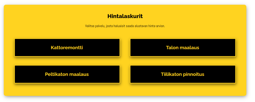
Lotta developed four service-specific pricing calculators designed to improve the website’s UX, allowing customers to obtain a preliminary cost estimate quickly and with minimal friction.
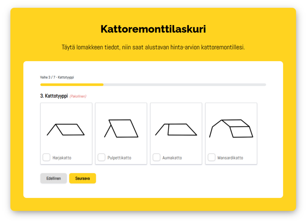
The solution was designed as a multi-step form with a clear user flow that guides users through the process in an intuitive and user-friendly way. Customers enter essential information — such as surface area, project scope, and other factors affecting pricing—and receive an estimated cost at the end.
“The key wasn’t just the calculation itself, but the overall UX and usability of the experience. We wanted customers to be able to assess and compare their situation at their own pace, without feeling pressured to contact the company immediately. That makes the service much more approachable.”
Lotta Poutiainen | kood/Sisu
Implementation
From a front-end development perspective, the solution was built using Gravity Forms within a WordPress and Elementor environment. The calculator logic required considerable planning, as each service involved multiple variables and unique pricing models.
- A clear, step-by-step user journey
- Seamless mobile usability
- Brand-consistent styling through custom CSS
The Result
Pricing Calculator
Rakennuspalvelu Nikki
The end result was a visually appealing UI and intuitive user experience that not only answers the customer’s pricing questions but also reduces conversion friction and lowers the barrier to making contact.
- A clear progress indicator throughout the form
- Dynamic content that adapts based on user selections
- A design aligned with the company’s brand identity
- An intuitive user experience
Project – Planray Oy

Redesigning the Quote Request Process – Clarity and Added Value
Planray wanted to redesign the quote request form on its website to improve the user experience (UX), usability, and overall digital customer journey. The goal was to introduce clearer, step-by-step guidance that would improve usability. At the same time, the company wanted a separate, faster version of the form designed specifically for professional use and sales activities.
The Starting Point
Planray already had a comprehensive quote request form in place that successfully collected information about customer needs. The challenge was not that the existing solution was ineffective, but that there was an opportunity to make it smoother, clearer, and better suited to different use cases.
The objectives were to:
- Improve the UX and usability of the form
- Create a clearer information architecture and more intuitive user flow
- Ensure that collected information supports the quotation process as effectively as possible
At the same time, the project presented an opportunity to better support internal sales workflows.
“The goal was to create a smoother and more efficient experience for customers while also improving the tools and processes used within the organization.”
Lotta Poutiainen | kood/Sisu
The Solution
Lotta approached the project from the perspectives of UX design, information architecture, and user interface structure.
The form content was reviewed and reorganized so that the questions followed a logical progression and focused on the most relevant information. The outcome was two complementary form solutions.
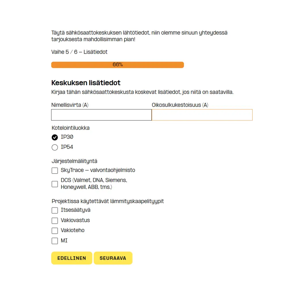
The first version was designed for end customers, with a strong focus on simplicity and ease of use. Key improvements included:
- Questions organized into a logical user flow
- Streamlined content focused on essential information
- Visual progress tracking with a progress bar to enhance usability and guide the user journey
The objective was to create a lightweight, user-centered experience that is easy to understand and complete.
“When a form progresses logically and looks clear, users find it more pleasant to complete and are more likely to finish it.”
Lotta Poutiainen | kood/Sisu
The second version, the Pro Form, was designed to support Planray’s sales process and customers who already possess technical knowledge and detailed project requirements.
It was specifically created for situations where information needs to be collected quickly and efficiently, such as:
- Phone conversations
- Customer meetings
- Trade shows and events
The more detailed question structure enables a deeper needs assessment while maintaining a fast and straightforward user experience. This significantly broadened the number of people within the organization who could effectively participate in the sales process.
“The solution was designed to support day-to-day work. Collecting the information needed for customer orders became easier, smoother, and more accessible across the organization.”
Lotta Poutiainen | kood/Sisu
Implementation
The solution was built in WordPress using Gravity Forms. Existing system requirements and limitations were taken into account from the start, ensuring a lightweight and manageable implementation.
The visual design was finalized with custom CSS styling, allowing the forms to integrate naturally with Planray’s website and brand identity.
- A clear, step-by-step user flow
- Excellent mobile usability
- Brand-consistent appearance through custom CSS
The Result
Customer Quote Request Form
Planray Oy
The redesigned solution evolved into a clearly structured UX solution that supports both the customer journey and the sales process.
- A smoother way for customers to request quotes
- A practical and efficient tool for sales teams
- Better support for downstream processing and quotation workflows
The transformation went beyond visual improvements and became an integrated part of a broader sales process.
“The result was a solution that supports both user experience and business objectives without unnecessary complexity”
Lotta Poutiainen | kood/Sisu
Summary
The Rakennuspalvelu Nikki and Planray projects started from very different situations, but both addressed the same fundamental question: how can the customer journey be made as smooth and natural as possible?
In both cases, the outcome was far more than a technical improvement. The projects positively impacted the customer journey by making information easier to understand and interactions easier to complete. When customers clearly understand what is being asked of them and why, businesses receive more accurate and actionable information—ultimately enabling them to deliver greater value.
These projects provide a strong example of how front-end development, UX design, and UI improvements can directly influence business outcomes. Through thoughtful information architecture, UX design, UI design, and conversion-focused user flows, it is possible to create digital services that are not only easier to use but also more effective in supporting business goals.